
Welcome to the Air Quality Stripes!
To see the stripes for yourself CLICK HERE
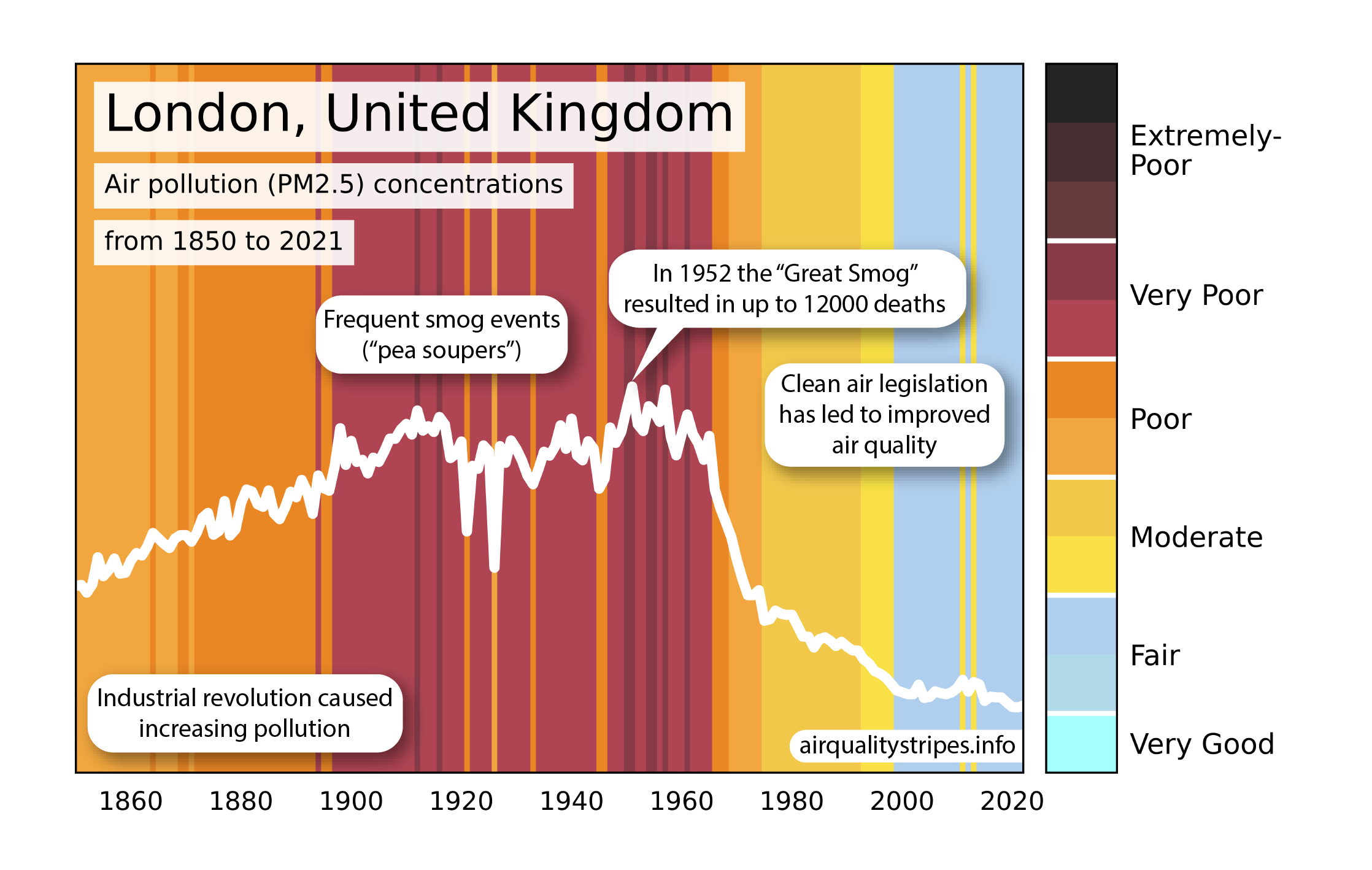
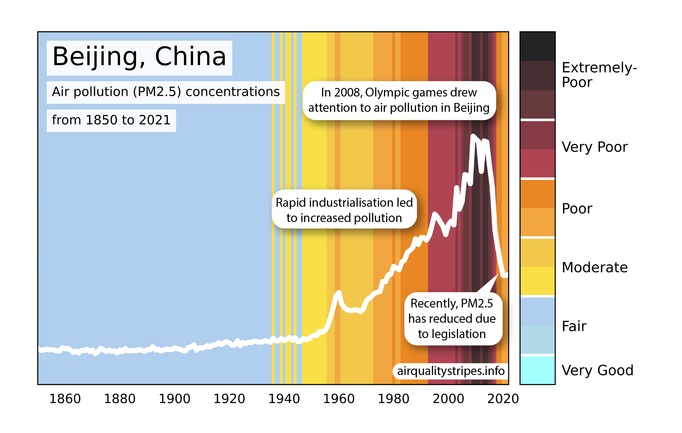
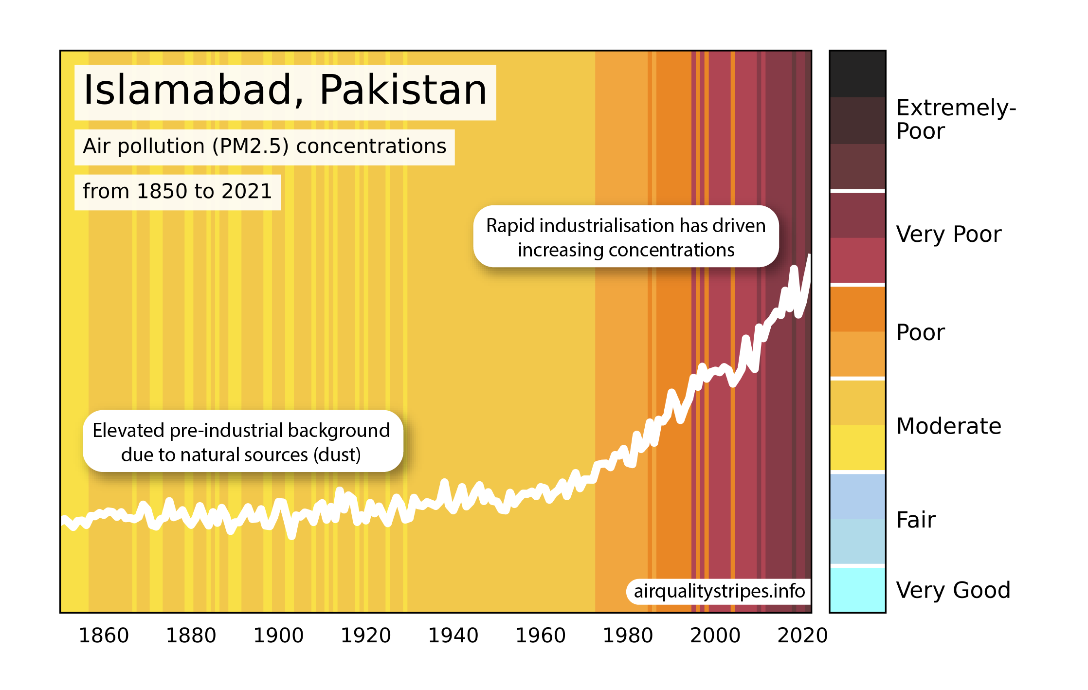
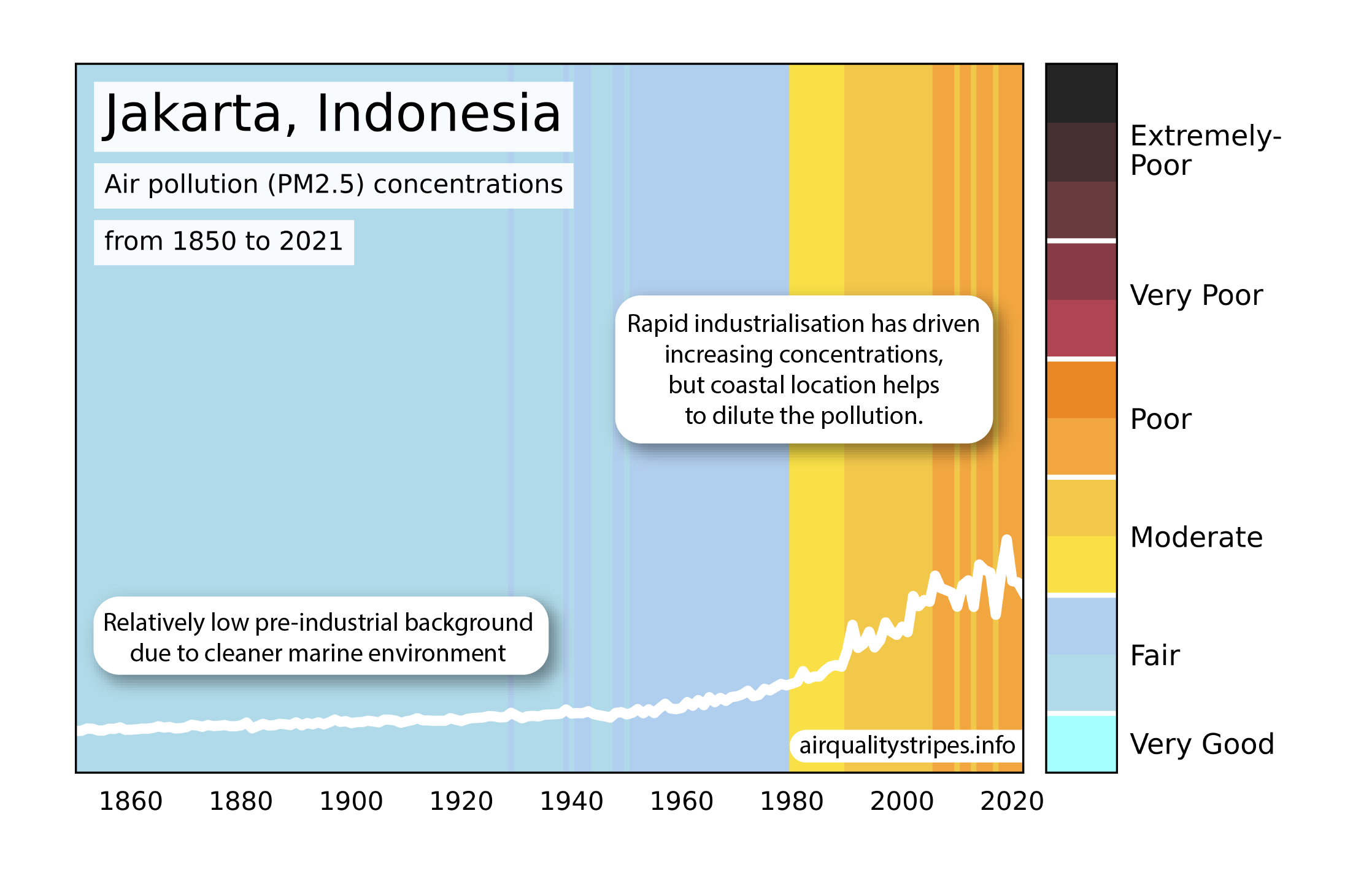
Inspired by the Climate Stripes created by Prof Ed Hawkins from the University of Reading,we have created these Air Quality Stripe images which show the change in particulate matter (PM2.5) air pollution from 1850 to 2021 in cities around the globe.
The PM2.5 data is from the UKESM climate model combined with satellite observations. The colour scale was informed by an artist who analysed google images of air pollution. The light blue colours represent the clean blue sky, with darker red and browns showing increasing amounts of air pollution.
"The images show that it is possible to reduce air pollution; the air in many cities in Europe is much cleaner now than it was 100 years ago, and this is improving our health. We really hope similar improvements can be achieved across the globe."
"The bottom line is that air pollution is one of the world's leading risk factors for death, it is thought to contribute to one in ten deaths globally. The Air Quality Stripes show the huge range in trends and concentrations around the world. Our stripes demonstrate that there is still more work to be done to reduce people’s exposure to poor air quality, and in some places a great deal more!"